Room Service Pizza
The problem I set was operational rather than visual: define an identity system a restaurant team can apply without a designer, at minimum print cost, and that does not degrade when the closing shift is the one running it.
Most hospitality brand systems do not fail on visual judgement. They fail because they assume whoever applies them has time, tools and inclination. In a room that closes at two in the morning, none of the three holds.
Constraints, fixed before anything was produced.
Three constraints, defined before the first file was opened, and none of them negotiable afterwards.
Three colours, no fourth
A cost decision before an aesthetic one: it keeps print to one or two inks and removes colour drift between suppliers. The cost is that hierarchy can no longer be solved by adding colour — it has to be solved with composition.
One pass per mark
The hand-drawn work is executed in a single pass. If it needs a second, the mark was wrong. That gives an objective acceptance criterion in an area that usually has none.
Legible on cardboard, one ink
The real substrate is a badly printed box, not a wall. Any piece that only works on screen is out by definition.
The wordmark.
Two words boxed in, joined by a cross, closed with an ellipse. The hand execution does the positioning work without verbal support — it communicates the category before a single line of copy is read.


The verbal system, defined before the visual one.
Tone was fixed first because it constrains everything after it. A menu that includes la pizza de t primo imposes a visual register and rules out others.
The rejected register documents as much as the chosen one — safe choices, empty slices and empty promises — because it marks the boundary against the category, which is where differentiation is usually lost in hospitality.
Colour system.
Black holds the largest surface area: cheapest ink, most stable across suppliers. Brick red is reserved as the single emphasis colour and assigned to high-visibility communication. Clover green does separation work and stops the black and red pairing from reading as hazard signage.
Type system.
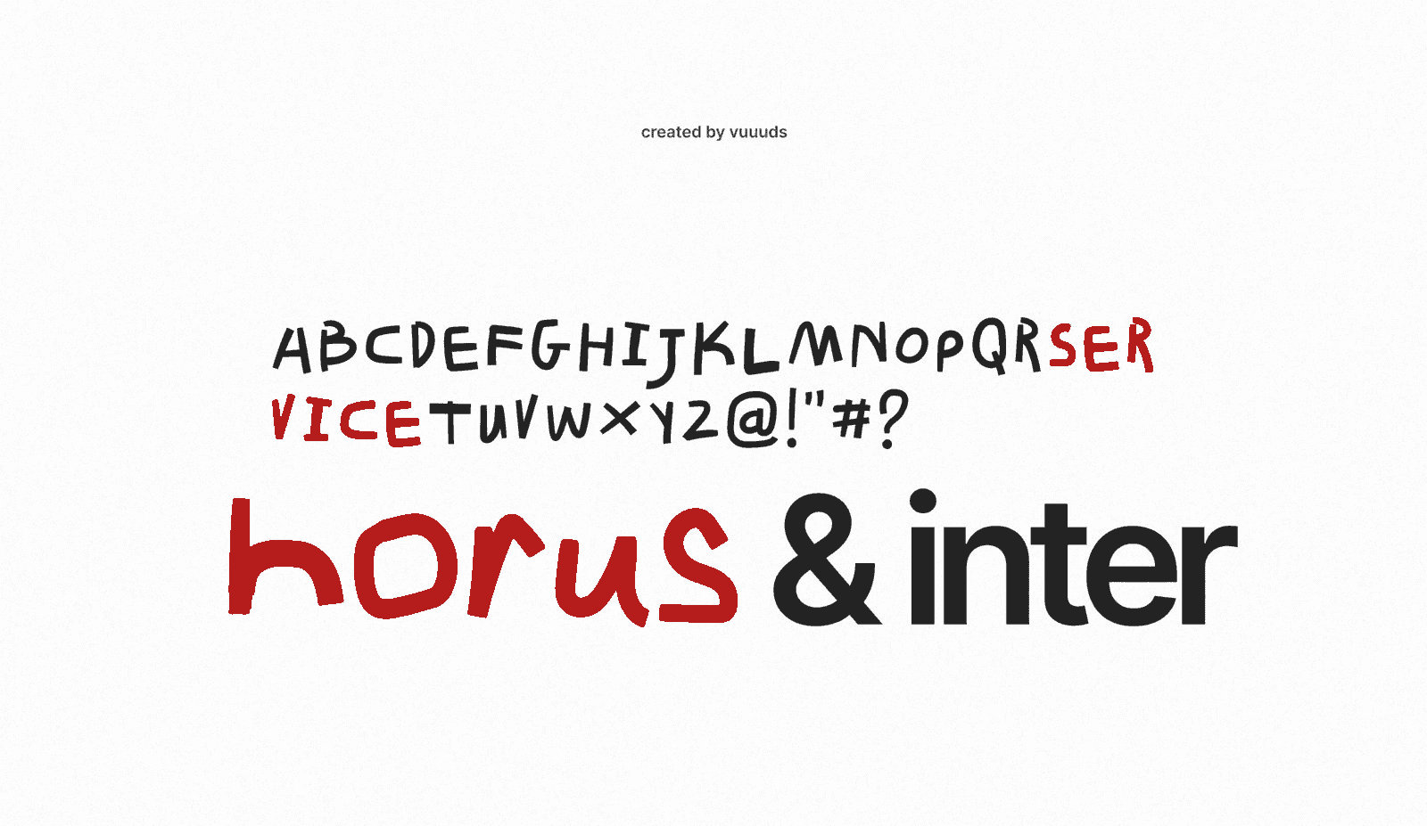
Two families with separated functions. The display face, drawn by hand, is restricted to names and headlines.1 All reading content — prices, allergens, address — is set in a neutral grotesque. The split is functional: personality cannot interfere with the information a customer needs in order to decide.

Print applications.
The opening posters carry a name, a date and nothing else.2 Two colourways so that repetition on a wall reads as a system rather than a production error. Sized to hold legibility in low-quality photography at middle distance, which is the actual distribution channel for an opening.
SERVICE
PIZZA.
06.2025
SERVICE
PIZZA.
06.2025
Publishing system.
Photo, flat colour, one line. The only variables are which of three colours and what the line says.
The design decision here is operational, not aesthetic: the person publishing is the closing staff, not a community manager. A system that needs a designer to stay consistent is a system that has already failed, so the margin for error is removed by construction.
Validation pending.
The system is complete but unverified in production. It has not been through a real print run, an extreme reduction of the wordmark, or degradation by a print supplier.
The next step is not more applications. It is one print run and one service cycle, measuring three things: whether the wordmark holds at minimum size, whether staff apply the publishing system without drifting, and whether the three-colour constraint survives the first supplier who proposes a fourth.